Button
Last Updated on Sep 29, 2022
Buttons are the primary visual cue for user interaction. They trigger actions, events, and navigation throughout our applications.
Component Variants
Design Principles
- Buttons should almost always have a label. In rare cases, due to space limitations, icon only buttons are acceptable. They should not be the norm.
- Icons are not required for buttons, but they make them more fun. Fun is good. See examples for our best practices.
- In most cases, icons should be on the left side of the label. Exceptions to this are when a button opens a menu or when a button opens or links to something. See the examples for “Next Step”, “Open Plan”, and “Continue Setup” below.
- Only 1 icon is allowed inside of a button.
- Don’t use icons in buttons that are “system controls” like buttons in a menu, modal, or dialog.
Writing Guidelines
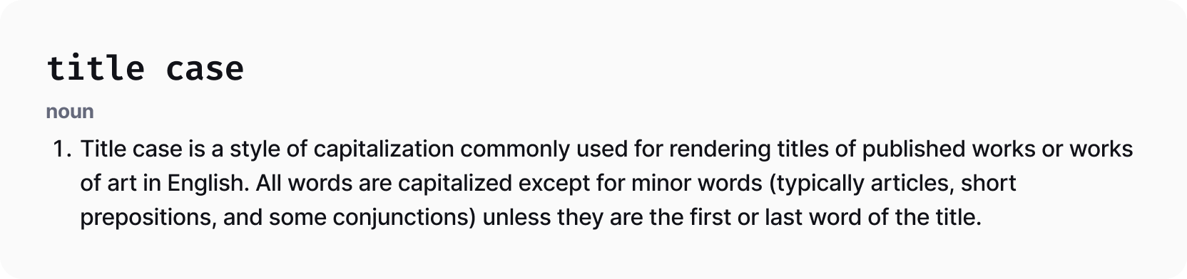
- Button labels are always title case. Examples: “Export File”, “Add to Cart”, “Submit”, “Export”. If you are unsure of the proper title case usage, consult TitleCaseConverter.com.
- Keep button labels as short as possible.
- Well written button labels usually contain a verb. Strive for either a single verb or a verb and a noun. For example, “Edit Campaign” is better than “Campaign Details”. In some cases, single nouns like “Views”, “Options” or “Layout” are acceptable.

Do's and Don'ts
Related Components